Mixed views on new coat of arms design

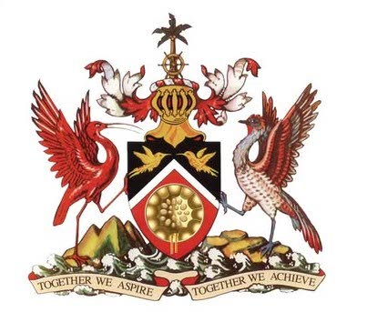
The newly updated national coat of arms continued to draw both criticism and praise the day after it was revealed by the Communications Ministry on January 19.
The coat of arms was designed by jeweller and designer Gillan Bishop, who had designed the Order of the Republic of Trinidad and Tobago medal and the Medal for the Development of Women. The Prime Minister announced her selection on August 29.
She presented at least seven designs to the Cabinet, from which one was chosen and presented to Parliament.
The National Emblems of Trinidad and Tobago (Regulation) (Amendment) Bill, 2025, which allowed the replacement of illustrations representing ships led by explorer Christopher Columbus with the national instrument, the steelpan, was unanimously passed in the Lower House on January 13.
The coat of arms now features the image of a gold pan and pansticks where Columbus’s ships once were.
One person who praised the new design was historian Prof Bridget Brereton, who said she found it attractive.
“I personally have no problem with the new design. I think Ms Bishop has done exactly what she was required/asked to do, that is, replace the three ships with a visually attractive steelpan, etc. I think it achieved what the Prime Minister wanted to achieve. I think she should be congratulated.
“I have read a few letters in the daily papers that said the steelpan shouldn’t be gold, but that’s not the point. It’s not supposed to be a literal rendition of a steelpan, it is heraldic, part of heraldry, so it didn’t bother me that it was gold.”
Asked what she thought of comments that colonial elements such as the helmet and ship's wheel remained on the coat of arms, she said,
“There could have been an effort to redesign the whole thing, but the decision was made to have a much more limited design, which I assume would be much less difficult and costly.”
Brereton said she assumed it would be gradually phased into use, in the same way new currency notes are gradually phased in, as there are many coats of arms to be replaced on stationery, buildings, etc.
Social media critiques came fast and furious, with people asking whether a graphic designer would not have been a better choice. Others said the placement of the pansticks, which point straight down, made the image look like a lollipop.
Others asked why public input had not been sought on the final design.
Graphic designer Ayrid Chandler, in a blog post titled TT’s Coat of Arms Redesign: My 2 Cents, said it could be argued that a country’s coat of arms is part of its visual identity, telling others how it sees itself, what’s important and how to be treated.
She said in 1962, artist Carlisle Chang was hired, but not paid, to design the coat of arms as part of a British tradition, with his sketch being sent to London to be properly illustrated by a heraldic artist in the style of all other coats of arms.
She said in 2024, after the pan got the recognition as the national instrument, was recognised internationally and given a world day, the current government announced that Columbus’s ships would be replaced by the pan on the coat of arms, hiring Gillian Bishop to do the redesign. She said the new coat of arms was presented two months later.
“To say I’m disappointed is an understatement. Jewellery and national awards are three-dimensional and the skill required to work with translating an idea into an object is quite different from the skills required to render a flat design that has to be used at multiple scales and formats with multiple agencies, to represent a country.
“I have deep respect for both artists who have worked to bring our coat of arms to light. I also have an issue with our country not understanding the importance of our identity and not going about the process the right way. Our national identity isn’t something that should be rushed. And it’s definitely not as simple as removing some ships and adding a newly appointed national instrument.”
Chandler said not all artists or designers did all types of design.
“If we’re only looking at the rendering of the cost of arms, an illustrator who can vectorise their work with clean lines is required to recreate the coat of arms. A coat of arms is a symmetrical thing, so the use of a grid system is needed. An understanding of colour and contrast is needed so that when the coat of arms gets embroidered on polos (polo shirts) or printed on signage outside government buildings, it is still clear and legible and most importantly, recognisable.”
She also addressed the issue of the colonial elements, and even the shape a coat of arms could take.
“The whole concept of a coat of arms is a British (sic), colonial tradition and other countries have designed theirs to be void of the traditional elements like the shield, helmet and plumes which are all heretic symbols. A rebranding discovery session would’ve highlighted these things.
Chandler said this was a missed opportunity and a reminder that although TT had been independent for over 60 years, the country was still in its infancy when it comes to understanding its people and treating the creative industry with the respect and understanding it deserves.
“This new coat of arms represents a long overdue step in the right direction. Is it poorly executed, absolutely, but as a creative and a citizen I’ve learned to focus on the good parts and just hope for the best, even when it feels like there’s no hope.”

Comments
"Mixed views on new coat of arms design"